Overview
M2M Ferries connects Mumbai and Mandwa through a first-of-its-kind roll-on/roll-off ferry service that makes coastal travel quicker and more comfortable. My goal with this project was to design their first-ever website, making route discovery, schedule checks, and ticket booking completely effortless.
From the start, I wanted the experience to feel simple and intuitive, whether someone is booking online for the first time or regularly uses digital platforms. The focus was on clarity and ease, ensuring users never feel lost or overwhelmed.
Instead of packing the interface with content, I leaned on a visually led design that guides users naturally through each step. By keeping things clean, minimal, and intuitive, the website allows users to do exactly what they came for, that is, plan their journey and book their sail without friction.
Problem
When I started working on the M2M Ferries website, this was a completely new kind of service for Mumbai. Unlike regular passenger-only ferries, M2M allowed people to travel with their vehicles and offered a more refined experience with added features and amenities. At the same time, the service needed to feel approachable, not intimidating or ultra-luxurious, for everyday passengers.
The challenge was designing a platform that could cater to a wide range of users: from tech-savvy travelers accustomed to online bookings to those less comfortable with digital platforms. While many people used the ferry as a commuting option, the website also needed to appeal to weekend travelers and tourists (solo travelers, groups of friends, and families) looking for a quicker and more enjoyable route to Mandwa. The experience had to reflect a sense of travel and leisure without overwhelming users.
Another key challenge was the scheduling system. Unlike trains or buses, M2M’s trips were not uniform. Schedules were finalized only two to three weeks in advance, and some days had significantly more trips than others. Additionally, boarding locations needed to be communicated clearly, especially in Mumbai, where the port was not widely known.
In short, the problem was about making a fresh and unique ferry experience feel accessible, intuitive, and appealing to a broad audience, while balancing flexible scheduling and varied user expectations.
Goals & Objectives
From the start, my goal was to design a website that made planning and booking a ferry journey as effortless as possible. I wanted users, whether tech-savvy or new to online bookings, to feel confident and in control at every step.
Key objectives I focused on:
- Seamless booking experience: Make it easy for users to select schedules, add vehicles, and manage passengers without confusion.
- Clarity and simplicity: Present information in a way that’s easy to scan, understand, and act on, without overwhelming users.
- Appeal to travelers: While the ferry serves daily commuters, the website also needed to attract weekend travelers, solo adventurers, groups, and families by highlighting convenience and travel benefits.
In short, the objective was to create an intuitive, approachable, and informative experience that balances practical booking needs with the excitement of a new travel option.
Research
Since M2M Ferries was a completely new service in Mumbai, there were no direct competitors offering vehicle-enabled ferry travel. However, the primary function of the website was ticket booking. To understand what makes booking experiences seamless and user-friendly, I studied popular travel platforms such as MakeMyTrip, Yatra, ClearTrip, and RedBus.
From this analysis, I identified several key practices that could be applied to the M2M Ferries experience:
-
Step-by-step booking flow
Platforms guide users through a clear sequence; selecting routes, choosing dates, adding travelers and vehicles, followed by payment. This reduces cognitive load and prevents users from feeling lost. -
Simple and scannable interface
Clean layouts, large buttons, and clear call-to-action placement make options easy to understand at a glance. Minimal distractions help users stay focused on the booking task. -
Dynamic date and schedule selection
Users can quickly view availability, blackout dates, and multiple schedule options. Calendar integrations with real-time updates reduce confusion and uncertainty. -
Traveler and vehicle details upfront
Allowing users to add passenger information, select preferences, and include vehicle details early in the flow helps the process feel complete and avoids surprises at the end. -
Instant feedback and confirmation
Clear summaries, confirmation screens, and transparent pricing reassure users that the booking is successful. Step indicators and visual cues reduce anxiety about errors. -
Trust-building through clear information
Clearly displayed policies, schedules, and location details help users feel confident and informed before completing their purchase.
Process
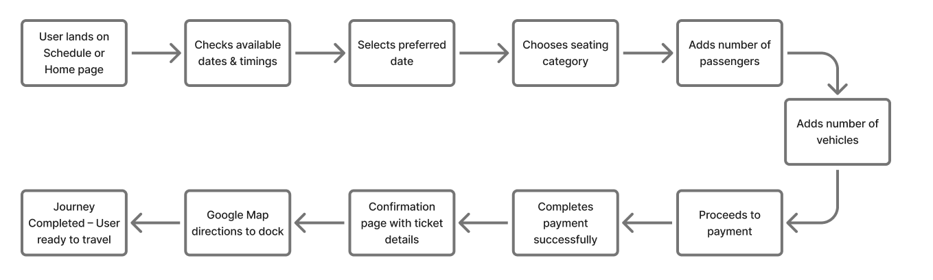
Booking Flow
To understand how users interact with the booking experience, I mapped out the journey from discovering available schedules to completing a ticket purchase. The goal was to ensure that each step felt intuitive, quick, and reassuring, especially for users booking online for the first time.
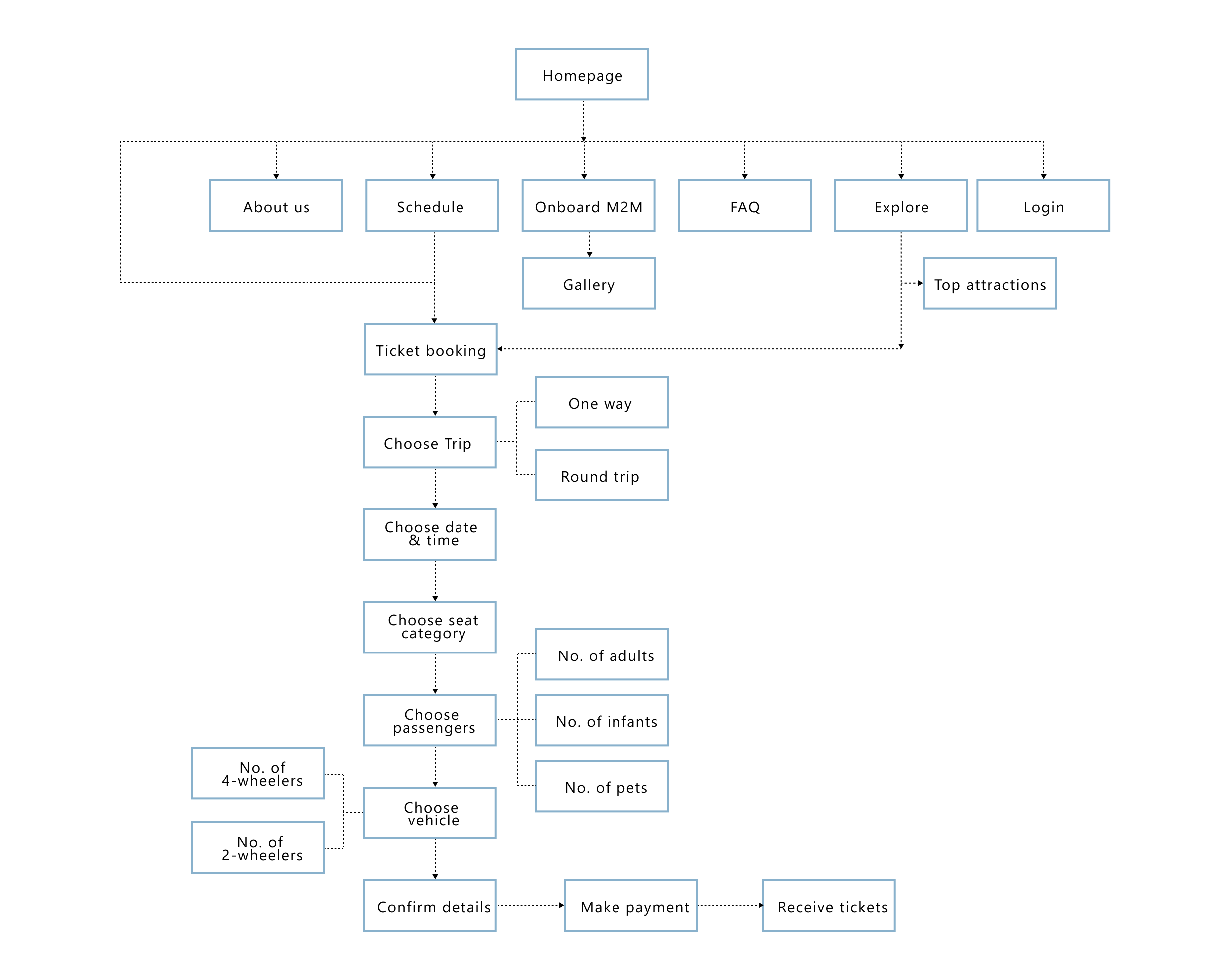
Information Architecture
Based on the booking flow and user journey, I identified the actions and features most critical to a smooth experience. Using these insights, I designed a sitemap that prioritised clarity, simplicity, and intuitive navigation.
This structured approach ensured that users always knew their next step, reducing uncertainty and creating a seamless end-to-end booking experience.
Wireframes
Once I had a clear understanding of booking patterns and best practices from popular travel platforms, I moved into ideation and wireframing. My goal was to translate those insights into a website that felt simple, intuitive, and accessible for all users.
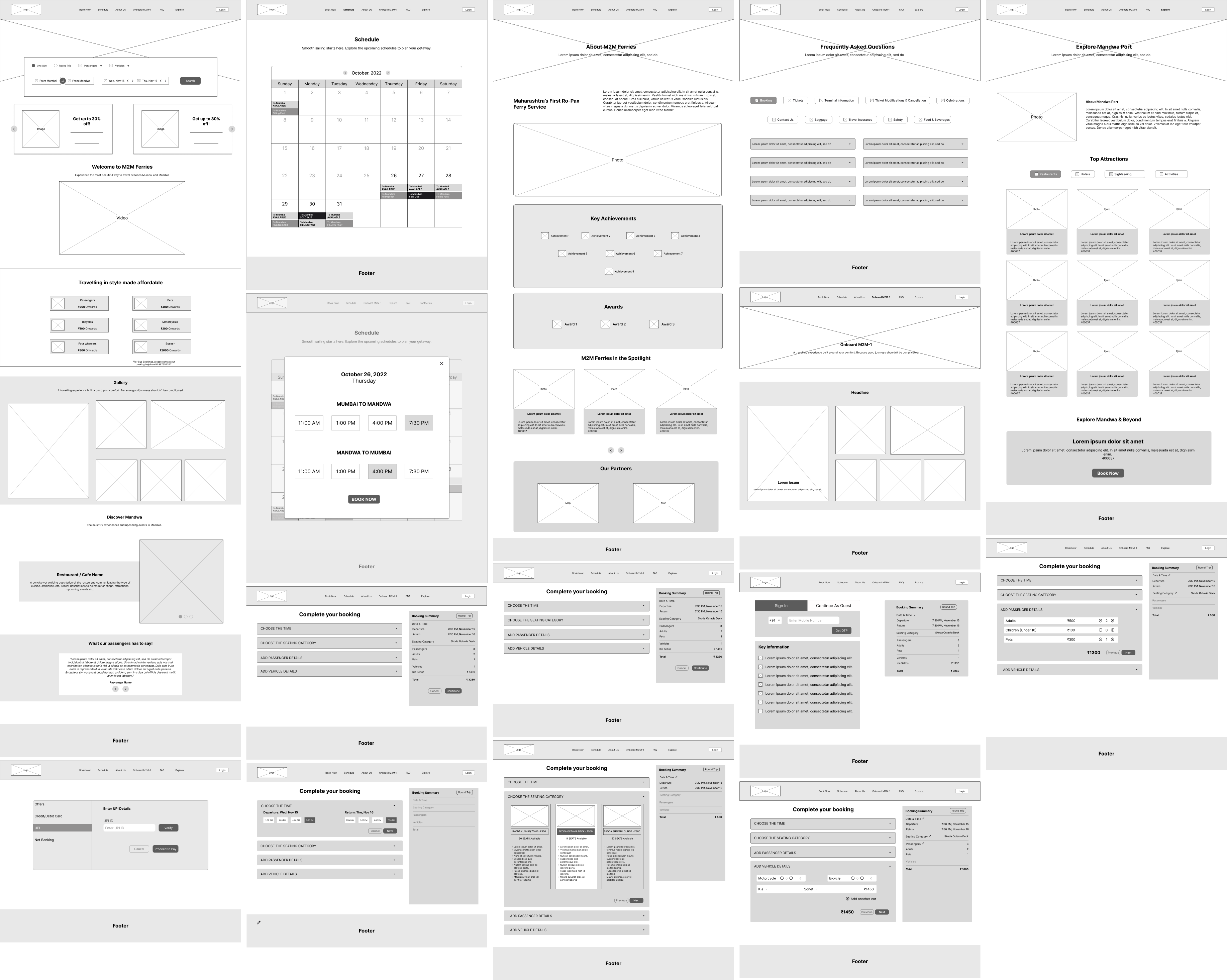
I began by sketching low-fidelity wireframes for the main flows like selecting schedules, adding vehicles, choosing passengers, and completing the booking. Inspired by travel booking apps, the focus was on step-by-step guidance so users could move through the process without confusion.
After multiple iterations and internal reviews, I refined the wireframes into mid-fidelity screens that laid the foundation for a clean, functional, and user-friendly booking experience. These wireframes guided the visual design and ensured the experience worked equally well for tech-savvy users and those less comfortable with online booking.
Visual Design & UI
Once the wireframes were in place, the project moved into visual design with the goal of creating a website that feels simple, clear, and easy to understand at a glance. Rather than relying on content-heavy layouts, the emphasis was on a visually guided experience that helps users navigate the booking journey with confidence.
The final UI designs were executed by another designer, while I remained closely involved in shaping design decisions through continuous inputs, reviews, and discussions. Some refinements were also made beyond the wireframes to accommodate stakeholder feedback and business considerations.
Key design decisions included:
- Color palette: Calm, neutral tones paired with clear accent colors for CTAs, ensuring important actions stand out without overwhelming users.
- Typography: Clean, legible type choices that allow schedules, ticket details, and locations to be scanned quickly.
- Visual hierarchy: Buttons, icons, and step indicators were intentionally sized and positioned to guide users naturally through the booking flow.
- Illustrations & imagery: Minimal, purposeful visuals were used to communicate routes, travel context, and ferry features without relying solely on text.
- Feedback & micro-interactions: Subtle animations and confirmations help users understand progress and errors, reducing friction during booking.
By keeping the interface functional, visually guided, and uncluttered, the final designs support a confident booking experience for both frequent digital users and first-time online bookers.
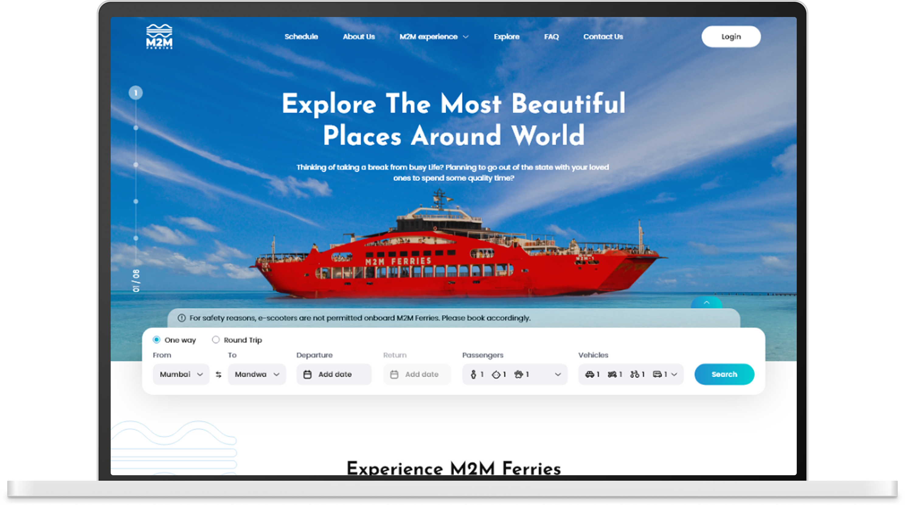
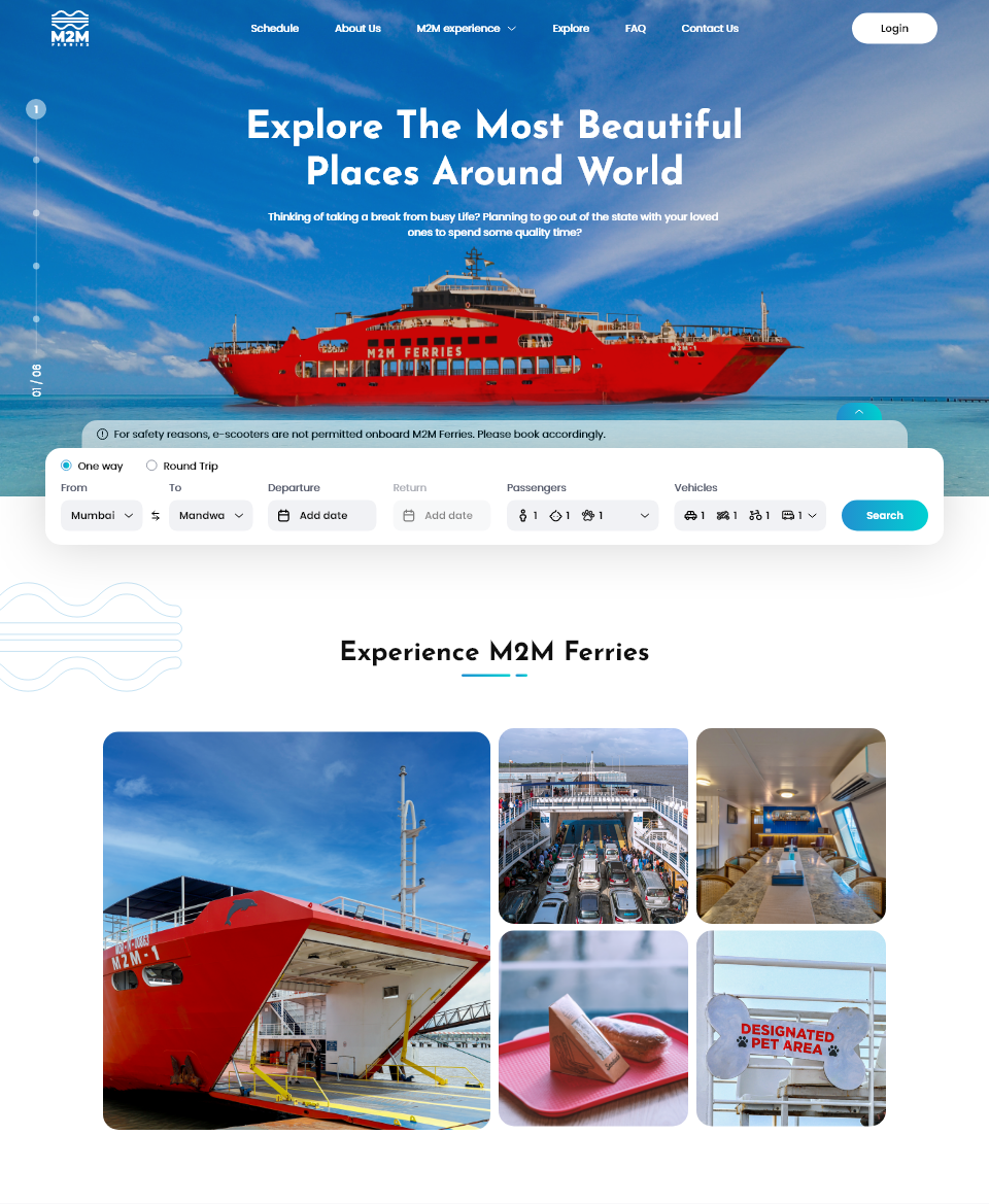
1. Home
The homepage introduces the ferry service and its offerings, showcasing ticket booking, routes, and key information at a glance. The layout is designed to immediately guide users toward booking, with clear calls to action and a visually clean structure that reduces cognitive load. (Below shown is the cropped image of the homepage wireframe)
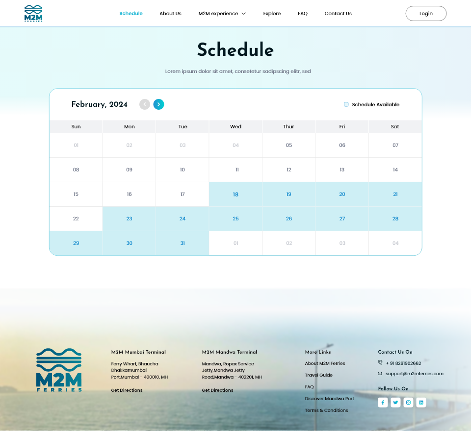
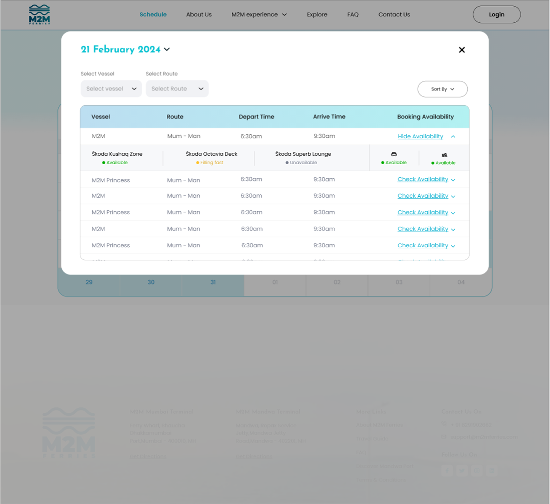
2. Schedule
Schedules for M2M Ferries are dynamic and vary by day. To address this, I designed a user-friendly calendar view that allows users to quickly see available trips, compare options, and plan their journey with confidence.
3. Booking
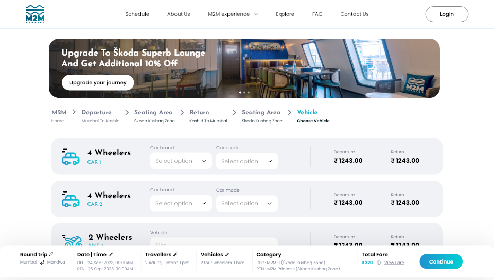
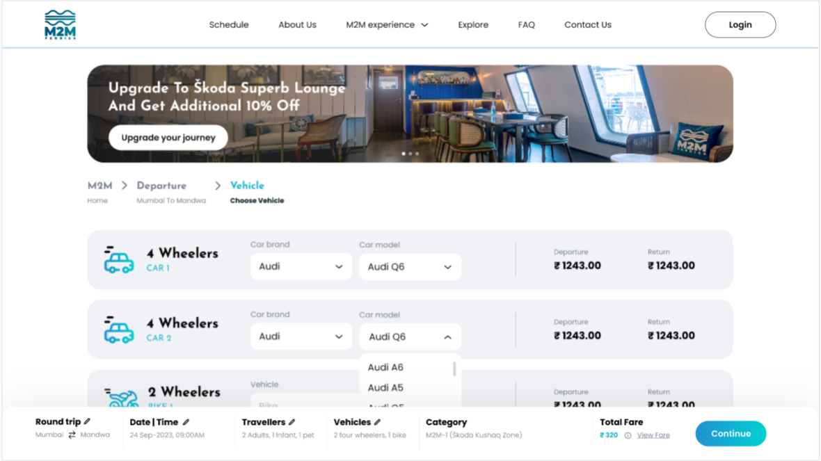
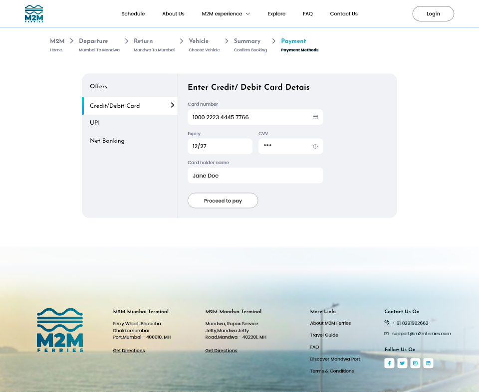
The booking flow is the core of the M2M Ferries website. The goal here was to make a multi-step process feel simple, predictable, and reassuring for users with varying levels of digital familiarity.
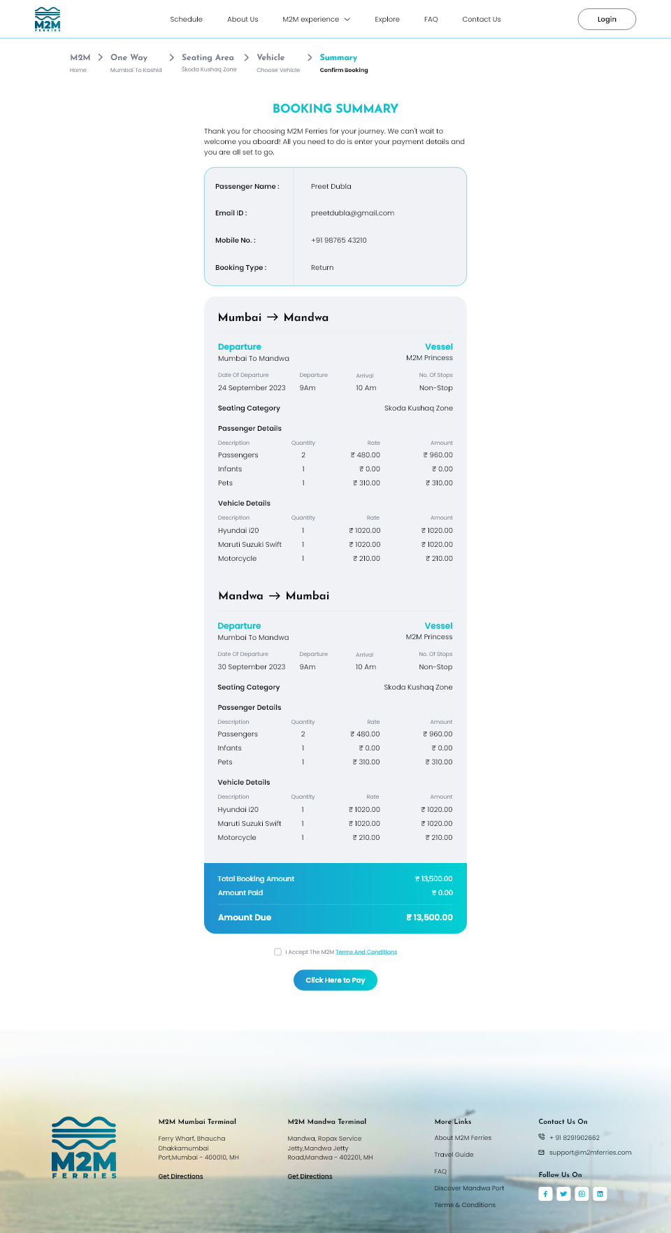
The journey follows a clear, step-by-step flow: selecting origin and destination ports, choosing travel dates and times, adding passengers and vehicles, reviewing the trip summary, and completing payment. Progress indicators, clear labels, and visual cues help users understand where they are in the process and what comes next.
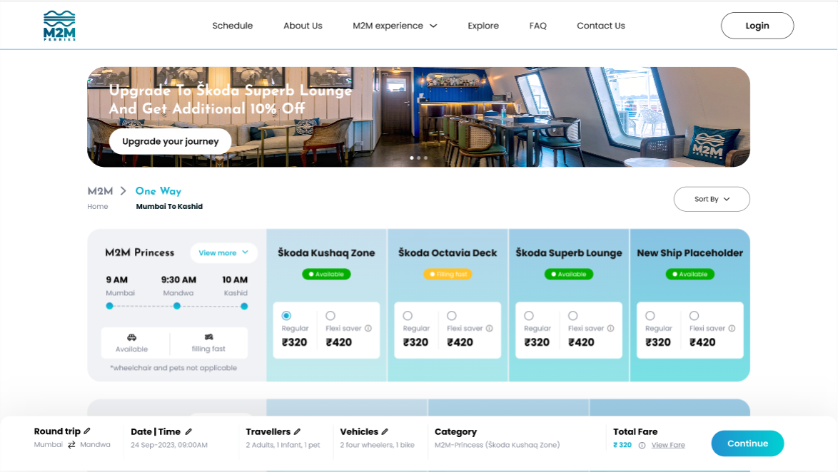
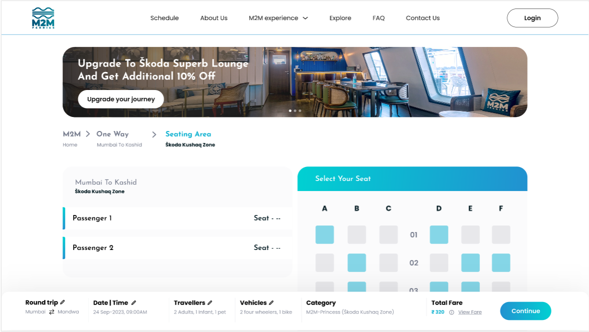
Since vehicle pricing varies based on car type, I designed a simple vehicle selection pattern that immediately reflects the correct fare. This removes ambiguity and ensures users are always aware of the total cost before moving forward.
Important trip-related information is surfaced clearly in the final step before payment. This ensures passengers are aware of essential details such as boarding requirements and preparation guidelines, without having to hunt through a separate terms and conditions page.
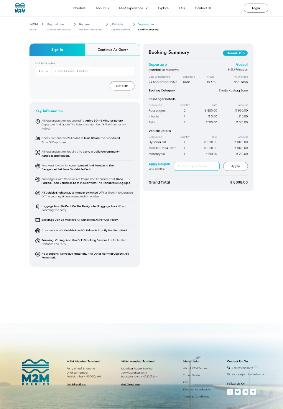
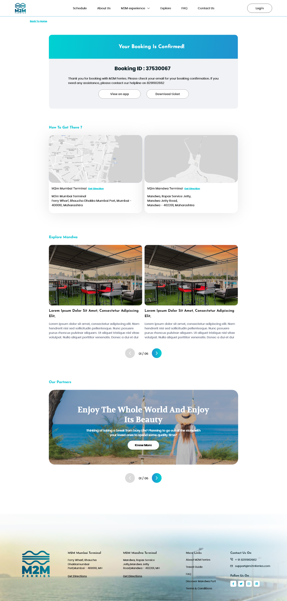
On the booking confirmation page, I focused on reducing post-booking anxiety. Clear port addresses are provided along with direct links to Google Maps, helping users navigate easily on the day of travel. The page also highlights key attractions in Mandwa, encouraging passengers to begin planning their trip as soon as their booking is complete.
4. FAQs
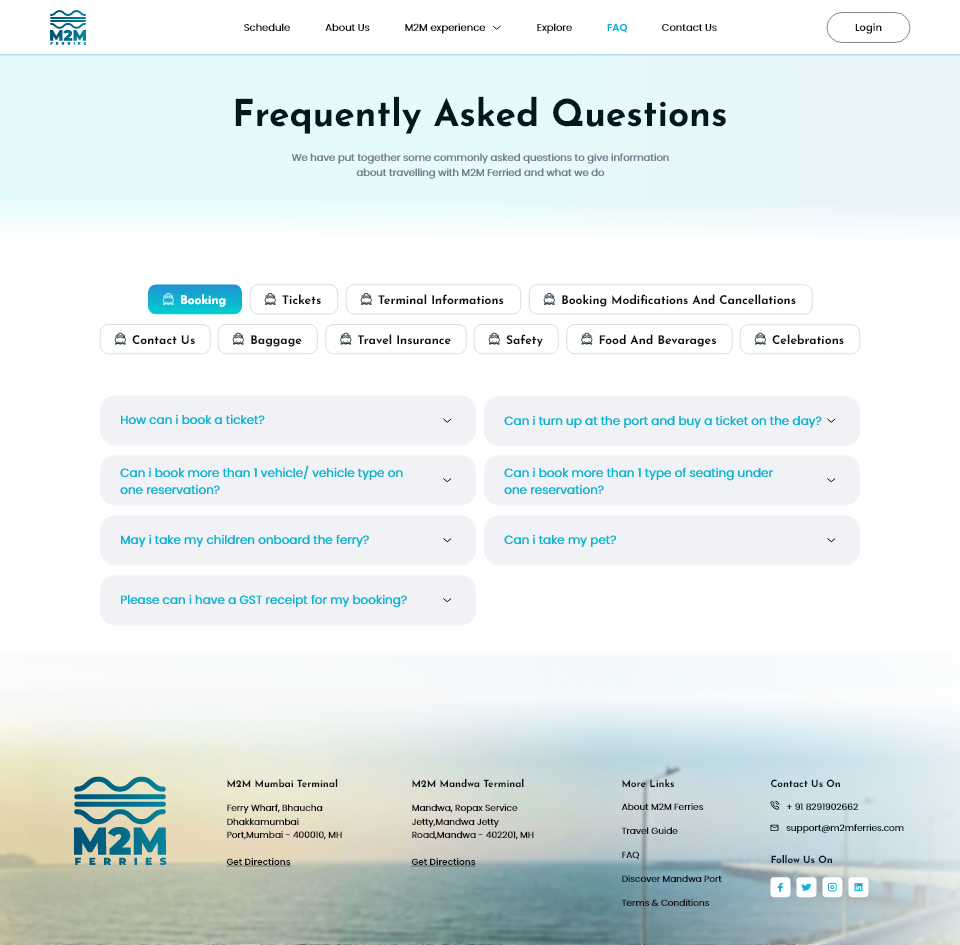
The FAQs page was designed to make finding information effortless. Instead of presenting users with a long, text-heavy list, questions are grouped into clear categories.
Users can click on each category tile to view relevant answers, avoiding the need to scroll endlessly. This interactive, tab-based structure improves accessibility and makes information discovery fast and intuitive.
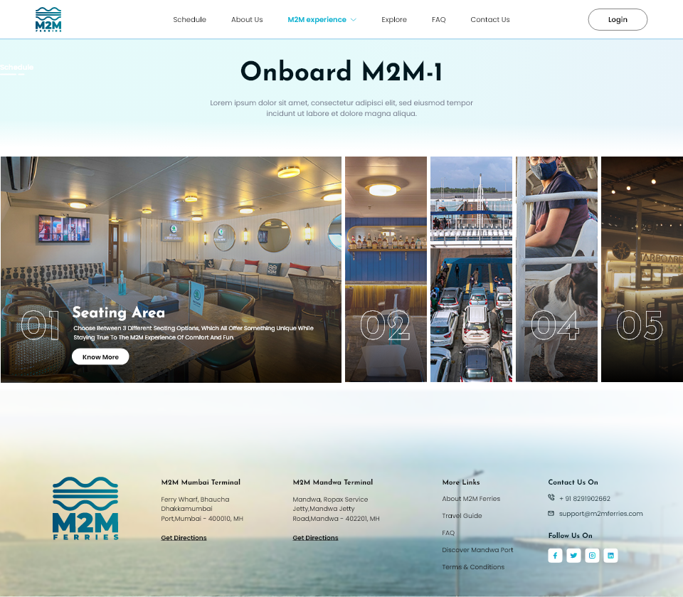
5. Onboard M2M
The Onboard M2M page showcases the onboard experience through an image-led layout, giving users a glimpse of the ferry’s design, amenities, and facilities.
The goal was to maintain an immersive yet lightweight experience, helping users feel familiar and excited about their upcoming trip without overwhelming them with information.
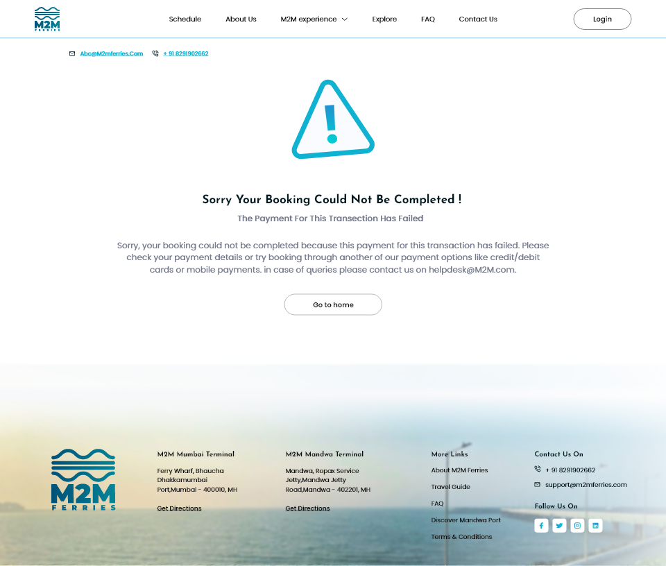
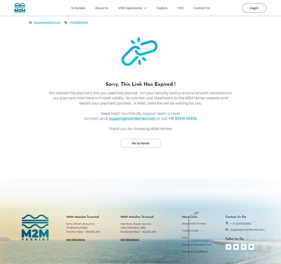
6. Error pages
For error pages, I chose a simple and direct layout that clearly explains what went wrong, why it happened, and what the user can do next. The intent was to reduce confusion at a frustrating moment and help users quickly recover, instead of leaving them at a dead end.
Outcome & Impact
This project was part of the official launch of M2M Ferries’ digital presence, with the website serving as the primary platform for discovery, information, and ticket booking. A clear, intuitive booking experience was critical in helping users understand a completely new mode of travel and convert interest into actual journeys.
Following the launch of the website, M2M Ferries saw steady growth in awareness and engagement. Organic engagement on Instagram grew by approximately 22% month-on-month, reflecting increasing interest in the service and its routes between Mumbai and Mandwa.
The improved clarity around schedules, routes, pricing, and booking flows helped reduce friction for first-time users. This coincided with an estimated 47% increase in travel volume on the Mumbai–Mandwa route over time, indicating stronger adoption of the service as a viable travel option.
Beyond quantitative metrics, the website played a key role in shaping how users perceived M2M Ferries. The service began to be positioned not just as a functional transport alternative, but as a preferred, more comfortable way to travel. Clear information, intuitive booking, and a visually guided experience helped build trust and confidence in a brand-new offering.
The project highlighted how closely product experience, user trust, and adoption are linked, especially when introducing a new service to a broad and unfamiliar audience.
Conclusion & Takeaways
Designing M2M Ferries’ first website was an exciting and fast-paced challenge. A smooth booking experience was absolutely crucial to the ferry's launch. The goal was to create a digital experience for a completely new kind of ferry service while keeping it intuitive and accessible for a wide range of users.
This project reinforced several key learnings:
- Balancing simplicity with functionality: Keeping the interface clean and visually guided made the booking process approachable for users with varying levels of technical comfort.
- Designing for diverse user groups: Considering daily commuters, weekend travelers, tech-savvy users, and those new to online booking shaped decisions around flows, scheduling, and visual hierarchy.
- Translating physical experiences into digital journeys: Clearly communicating ferry features, boarding locations, and travel benefits helped convey the value of the service beyond just ticket booking.
- Adapting under pressure: Working within a short timeline and evolving requirements pushed me to embrace ambiguity, rely on strong intuition, and make clear, timely design decisions.
- Collaborating across perspectives: Aligning inputs from multiple stakeholders into a cohesive design vision highlighted the importance of empathy, communication, and shared understanding in the design process.
Overall, this project strengthened my belief that good UX is about making complex processes feel effortless. By prioritizing clarity, visual guidance, and intuitive flows, the website enables users to book their ferry journeys with confidence while clearly communicating the ease and convenience of traveling with M2M Ferries.