Project Overview
Compass is a user-friendly platform designed to empower remote customer service teams in managing incoming service requests with ease and efficiency. Tailored for young professionals stepping into the world of customer support, Compass simplifies complex workflows, making it accessible even for freshers with little to no experience using advanced support tools.
My goal was to create a responsive website that acts as a seamless hub for receiving, organizing, and reporting on service requests, ensuring every query is addressed promptly and professionally.
By prioritizing simplicity, clarity, and intuitive design, Compass aims to enhance productivity, reduce onboarding time, and provide a smooth experience for customer service teams working remotely.
Problem
Remote customer service teams, especially young professionals or freshers, often struggle with complex support tools that are not tailored to their level of experience. These tools can be overwhelming, leading to inefficiencies in managing, organizing, and resolving incoming service requests.
The lack of a simple, intuitive platform also increases onboarding time, hampers productivity, and affects overall service quality.
Compass aimed to address these challenges by:
- Designing a user-friendly platform specifically for remote customer service teams, prioritizing ease of use for freshers and less-experienced professionals.
- Streamlining service request workflows to make it easier to receive, manage, and track requests.
- Providing intuitive reporting tools to help teams monitor performance without requiring advanced technical skills.
- Improving overall productivity by minimizing the learning curve and focusing on efficiency.
Research
I examined popular tools like Zendesk, Freshdesk, and Intercom to identify shortcomings specific to fresher-friendly use cases. I also conducted interviews with customer service professionals, focusing on their daily workflows and challenges.
Competitive Analysis
I conducted a detailed analysis of competitors to understand their strengths, weaknesses, and opportunities for Compass. The results of my research are given below.

Zendesk
Strengths
- Strong brand presence and customer trust.
- Comprehensive ticketing system with automation and robust reporting tools.
- Scalable plans for businesses of all sizes.
Weaknesses
- Steep learning curve for new or less-experienced users.
- Higher cost for advanced features.
- Overwhelming interface for freshers.
Freshdesk
Strengths
- Intuitive and user-friendly interface suited for beginners.
- Affordable pricing with a free plan available.
- Wide range of integrations with other tools.
Weaknesses
- Limited customization options in lower-tier plans.
- Reporting features may not be as detailed as competitors.
- Overlapping features can confuse users.
Intercom
Strengths
- Modern interface and real-time chat capabilities.
- Focused on customer engagement and personalized support.
- Excellent for small to medium-sized remote teams.
Weaknesses
- Expensive compared to similar tools
- Lacks comprehensive ticket management features.
- More geared toward proactive communication than reactive support.
Zoho Desk
Strengths
- Cost-effective solution with a variety of features.
- AI-based automation and reporting tools.
- Easy integration with Zoho’s ecosystem for businesses using other Zoho products.
Weaknesses
- The interface can feel cluttered for beginners.
- Limited third-party integrations compared to other tools.
- Less emphasis on user experience for freshers.
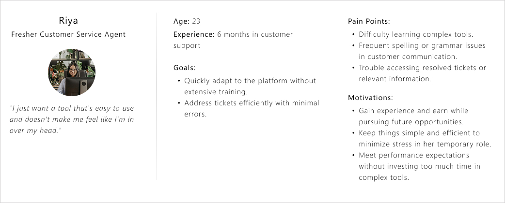
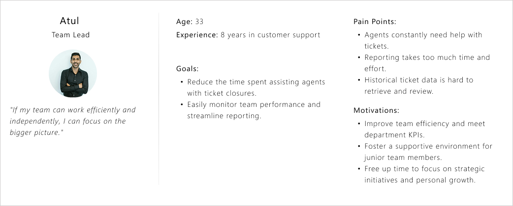
User Persona
To design the solution with clarity and empathy, I looked at the experience from two key perspectives. One is a fresh support agent finding their footing on the job, and the other is a team leader balancing people, performance, and outcomes. These personas set the context for the flows and decisions that follow.
User Journey
To better understand the user experience, I mapped out the journey of agents using current tools. This helped me pinpoint the key pain points in each stage, from onboarding to reporting, and understand where Compass can make a real difference.
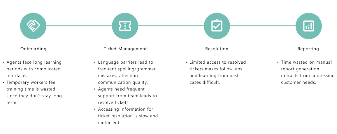
Pain points identified in the journey
Learning Curve
As most agents are freshers with little to no experience, learning a new platform can be overwhelming. Long training periods are impractical since many employees see customer service as a temporary gig until they move on to other opportunities like higher studies or new jobs.
Language Barriers
Since English isn’t the first language for many, grammatical and spelling mistakes during chats are frequent, leading to communication challenges.
Ticket Management
Many agents require assistance from team leads or experienced peers to close tickets. Agents often need quick and seamless access to information while addressing tickets to avoid delays.
Reporting Challenges
A significant amount of time is wasted creating reports manually or navigating through complicated tools.
Historical Data Access
Accessing previously resolved tickets is cumbersome and time-consuming, which hinders efficiency.
Opportunities for Compass
Ease of Use
A simple, intuitive platform with minimal training requirements.
Language Assistance
Incorporate built-in spell check and grammar suggestions to support non-native English speakers.
Ticket Management
- Enable quick access to knowledge bases and previous ticket resolutions.
- Add a collaborative feature for agents to seek assistance from team leads seamlessly.
Reporting Automation
Simplify and automate reporting to save time.
Search Optimization
Make historical tickets easily searchable with filters and tags.
Process
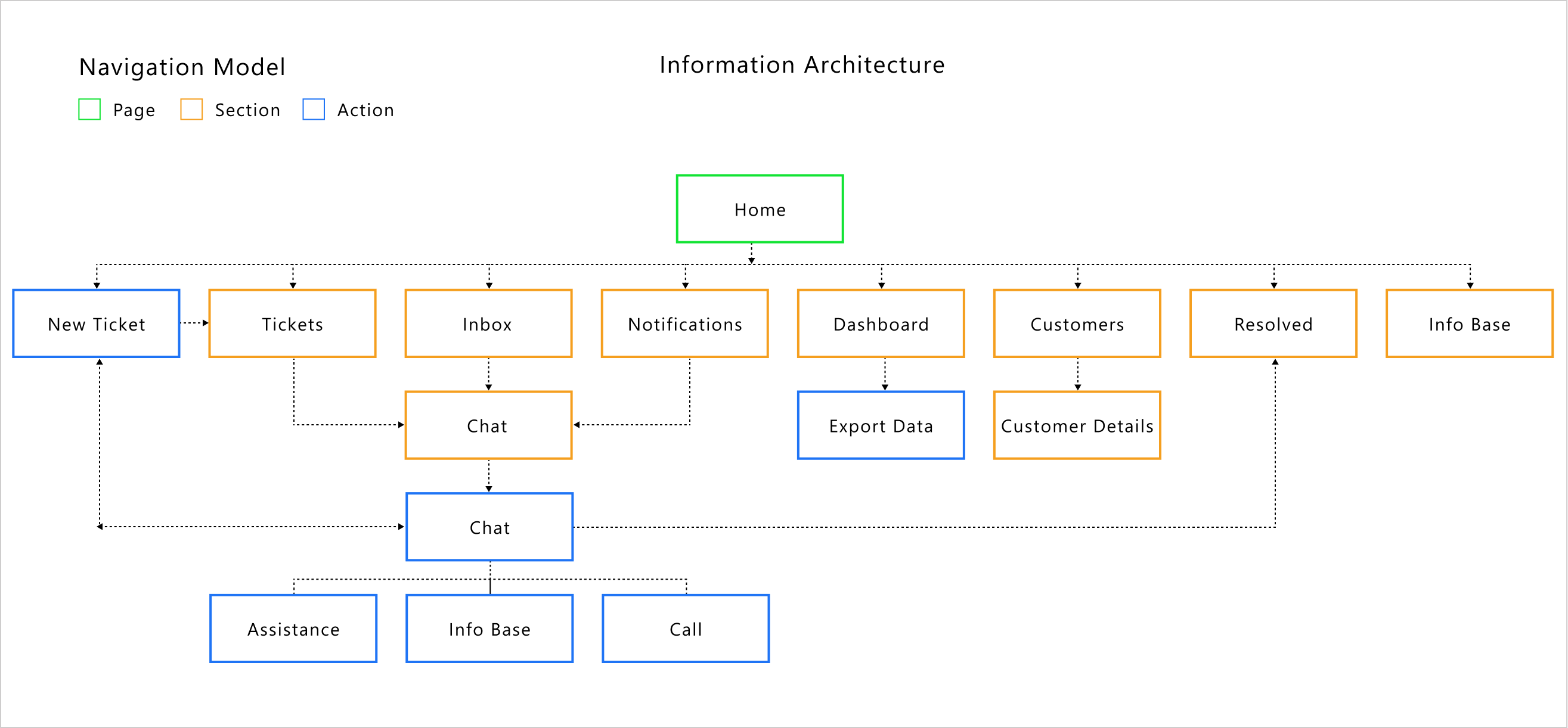
Information Architecture
Creating a clear and logical Information Architecture was crucial for Compass to ensure effortless navigation and usability. By organizing features like ticket management, reporting, and knowledge access into an intuitive structure, I aimed to minimize the learning curve for users. The goal was to make every interaction straightforward, especially for freshers stepping into customer support roles.
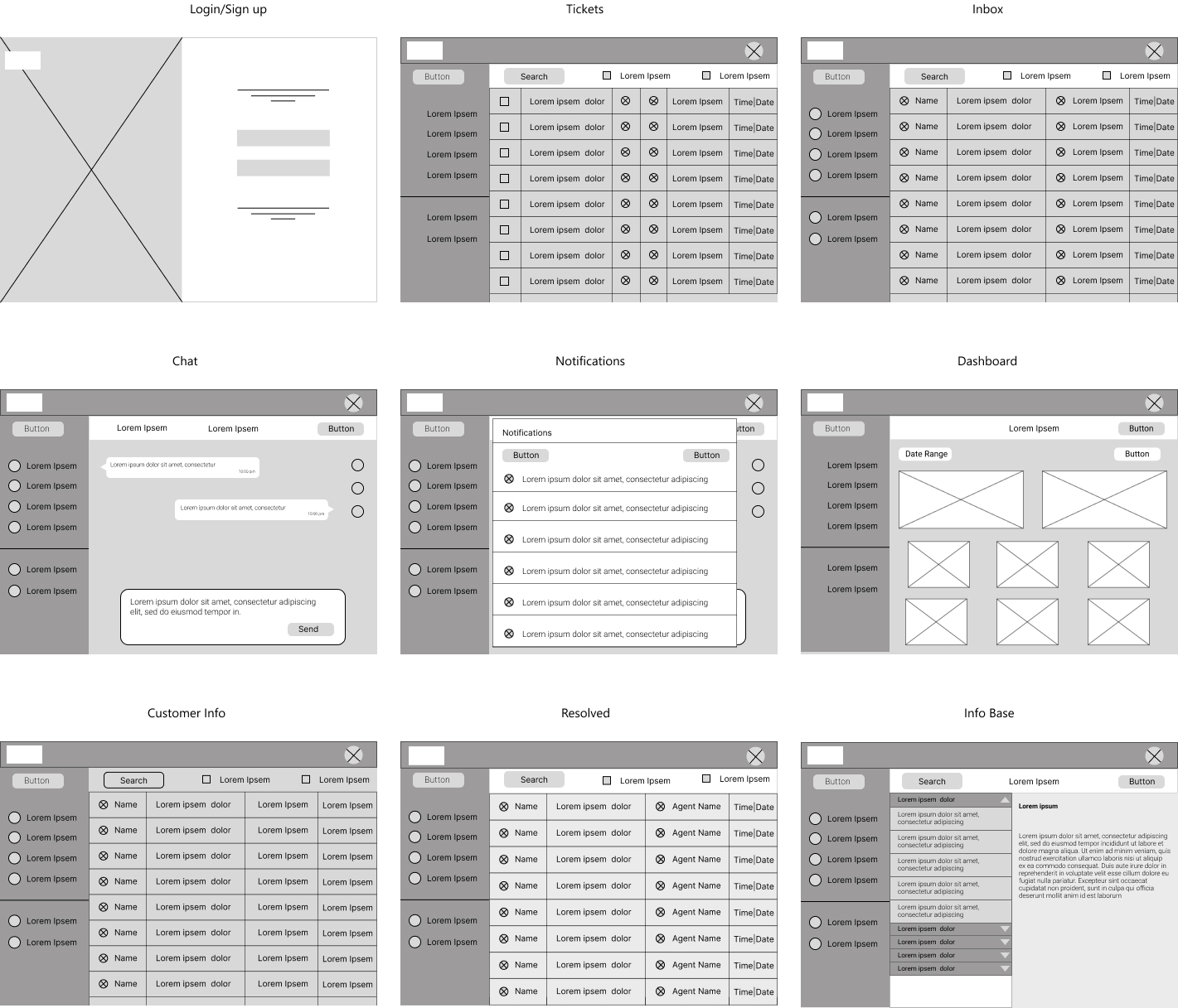
Wireframes
Wireframing was the next step to visualize the structure and functionality of Compass. I focused on creating a clean, user-friendly layout that aligns with the needs of young customer service professionals.
The wireframes prioritized simplicity and easy navigation, ensuring quick access to essential features like ticket management, reporting, and knowledge resources. This phase helped refine the design before moving into detailed development.
Design
Now, it was time to bring all the ideas to life. I focused on creating clean, user-friendly designs that make navigating Compass effortless for agents. Every detail was carefully thought out to ensure the platform feels intuitive and practical, making daily tasks smoother and more efficient.
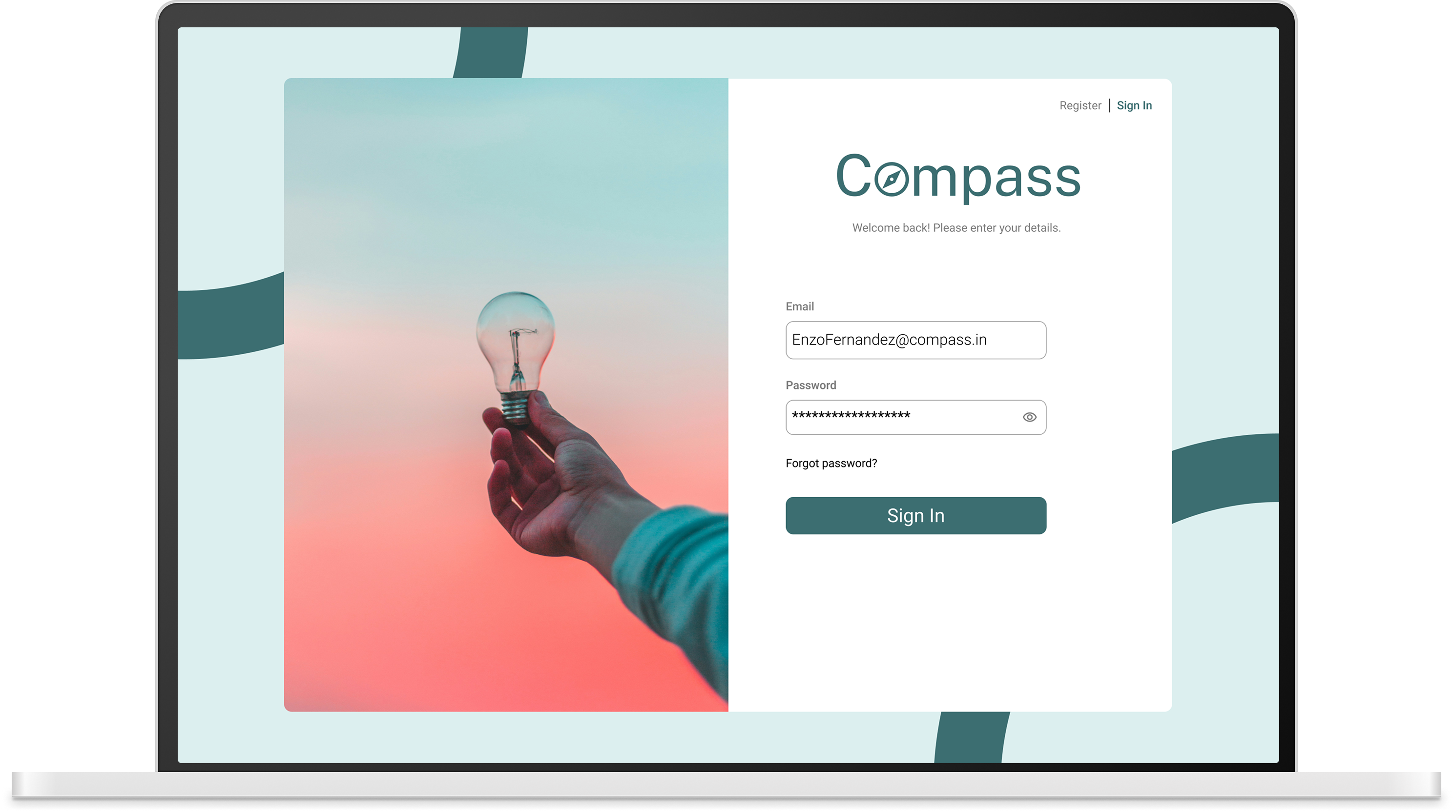
Sign Up / Sign In
.png)
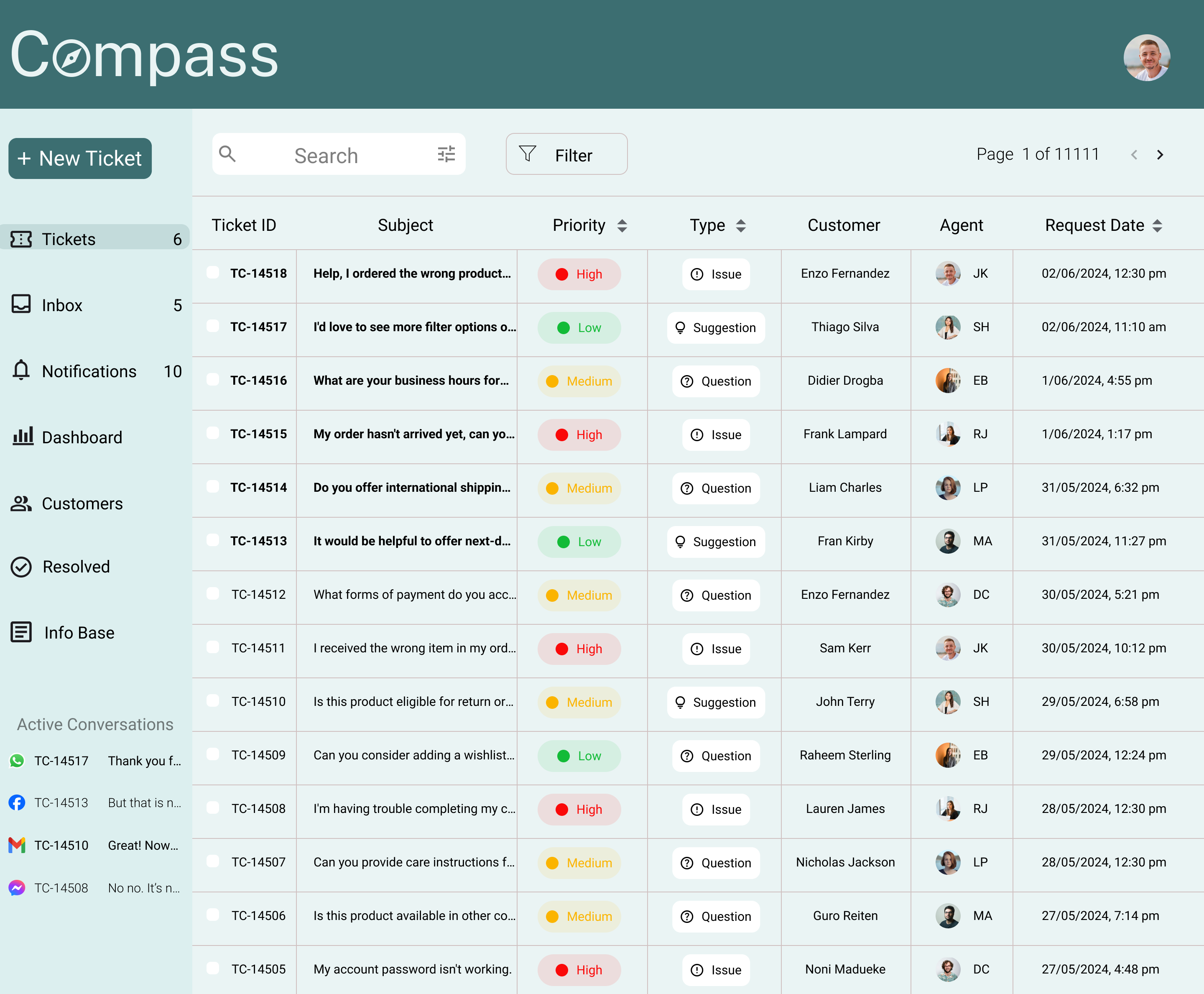
Tickets Page
The objective was to create an interface that agents can easily master. I designed the tickets interface similar to Gmail, as it is something most agents are already familiar with—whether experienced or freshers. The layout ensures that every function is easily accessible from all sections. The ticket list provides a clear overview of priority, request type, client name, and the agent assigned to each ticket.
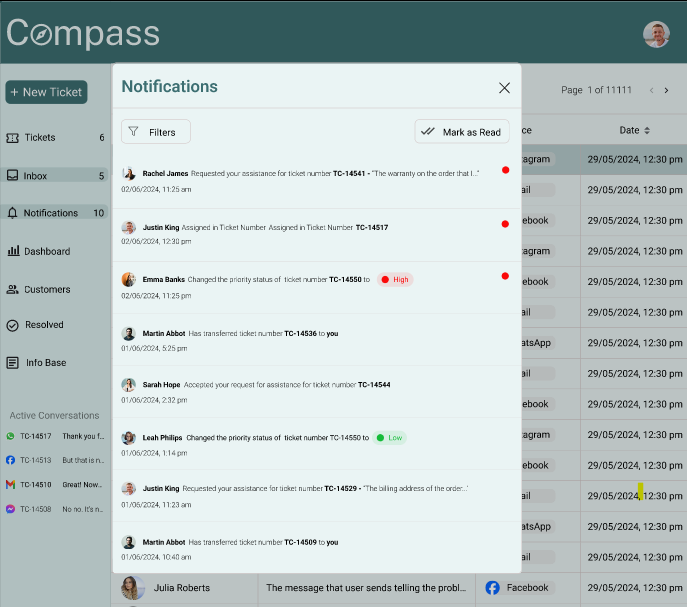
Notifications
Notifications were designed as a pop-up window that can be accessed from any page within the platform. This allows agents to stay updated without interrupting their workflow.An option to filter notifications was also added, helping agents focus only on what is relevant at any given moment.
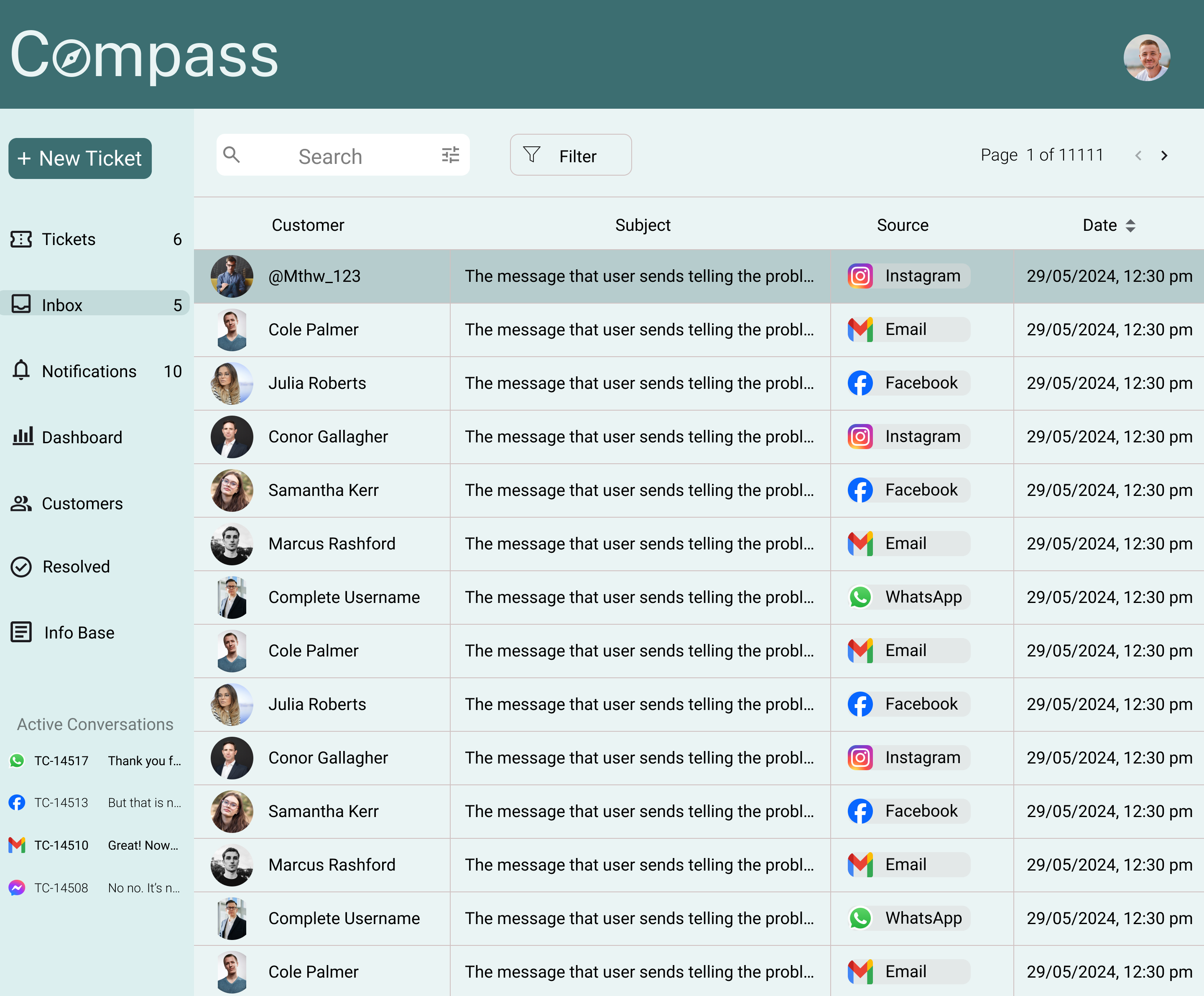
Inbox
The inbox design provides a clear and organized view of incoming messages. Each message displays key details such as the source, date, time, and a preview of the message content. For unassigned tickets, the inbox shows the customer’s username as it appears on the app or messaging platform. Once a ticket is assigned, the username is replaced with the customer’s actual name, enabling better personalization and clarity.
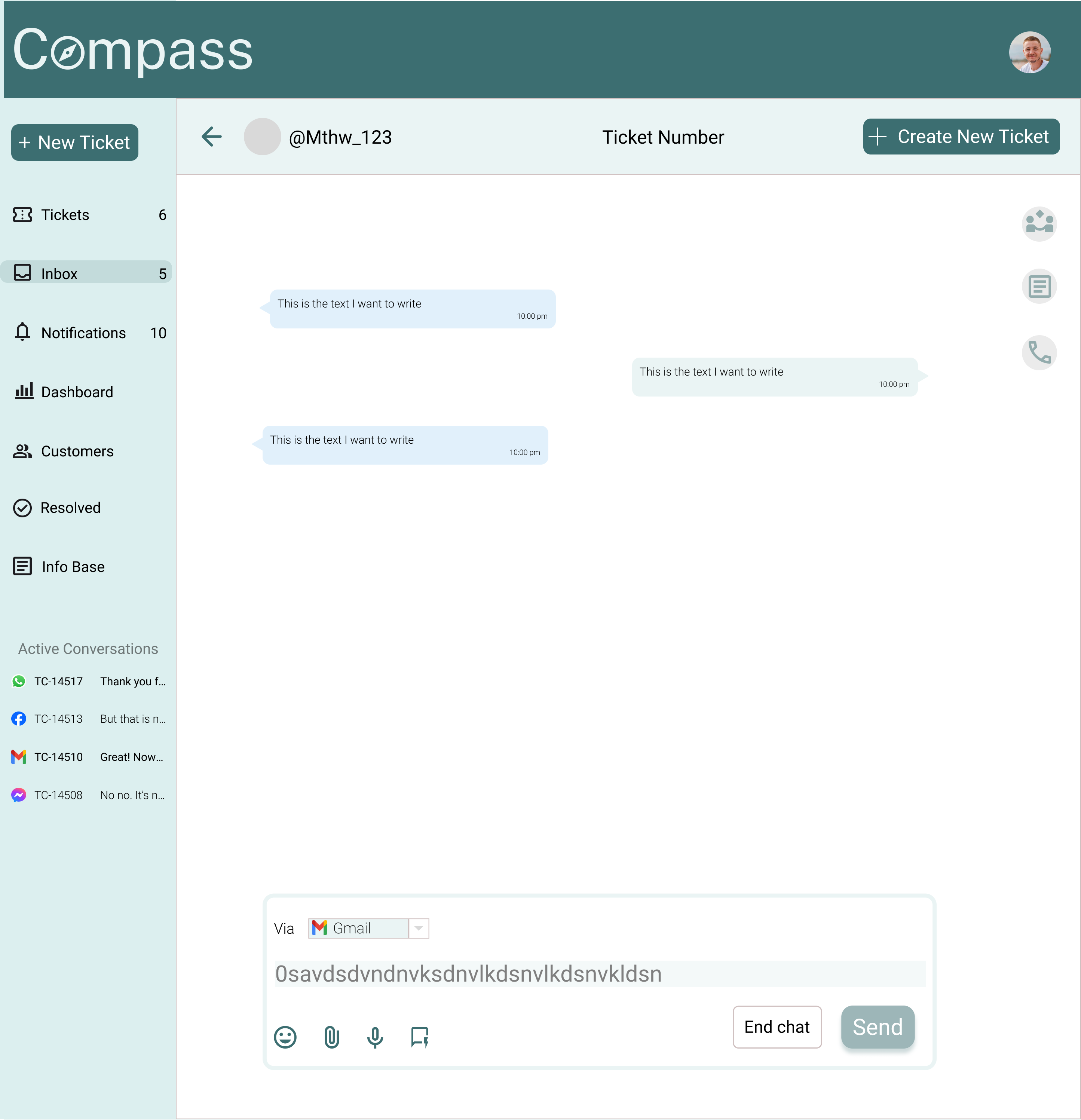
Chat
The chat section was designed to directly address the key pain points uncovered during research, enabling agents to resolve customer queries efficiently without breaking their workflow.
Create Tickets
Agents can easily create tickets directly from new incoming messages. From the same window, they can select categories and priorities, add customers to tickets, and send tickets via email, chat, and other channels.
Assistance
A quick chat option allows agents to seek assistance from other agents without leaving the conversation. Online status indicators help agents reach out to colleagues who are currently available. Agents can also add another agent to an ongoing customer chat to receive real-time guidance.
Info Base
Easy access to the Info Base is provided within the chat. Agents can search for helpful articles, quickly find relevant information, and send articles directly to customers when detailed explanations are required.
Messaging
The chat interface clearly displays the platform from which the customer is messaging. Agents can switch platforms using a drop-down menu when responding. Pre-written quick responses are also available, allowing agents to respond faster based on common situations.
One major pain point identified during research was the high occurrence of spelling and grammatical mistakes in chats, especially since most agents are freshers and English is not their first language.
To address this, I proposed an AI-powered grammar and spell checker integrated directly into the chat text box. The ‘Send’ button remains inactive until all errors are corrected or manually confirmed as valid (such as names or domain-specific terms), ensuring professional communication while still giving agents control.
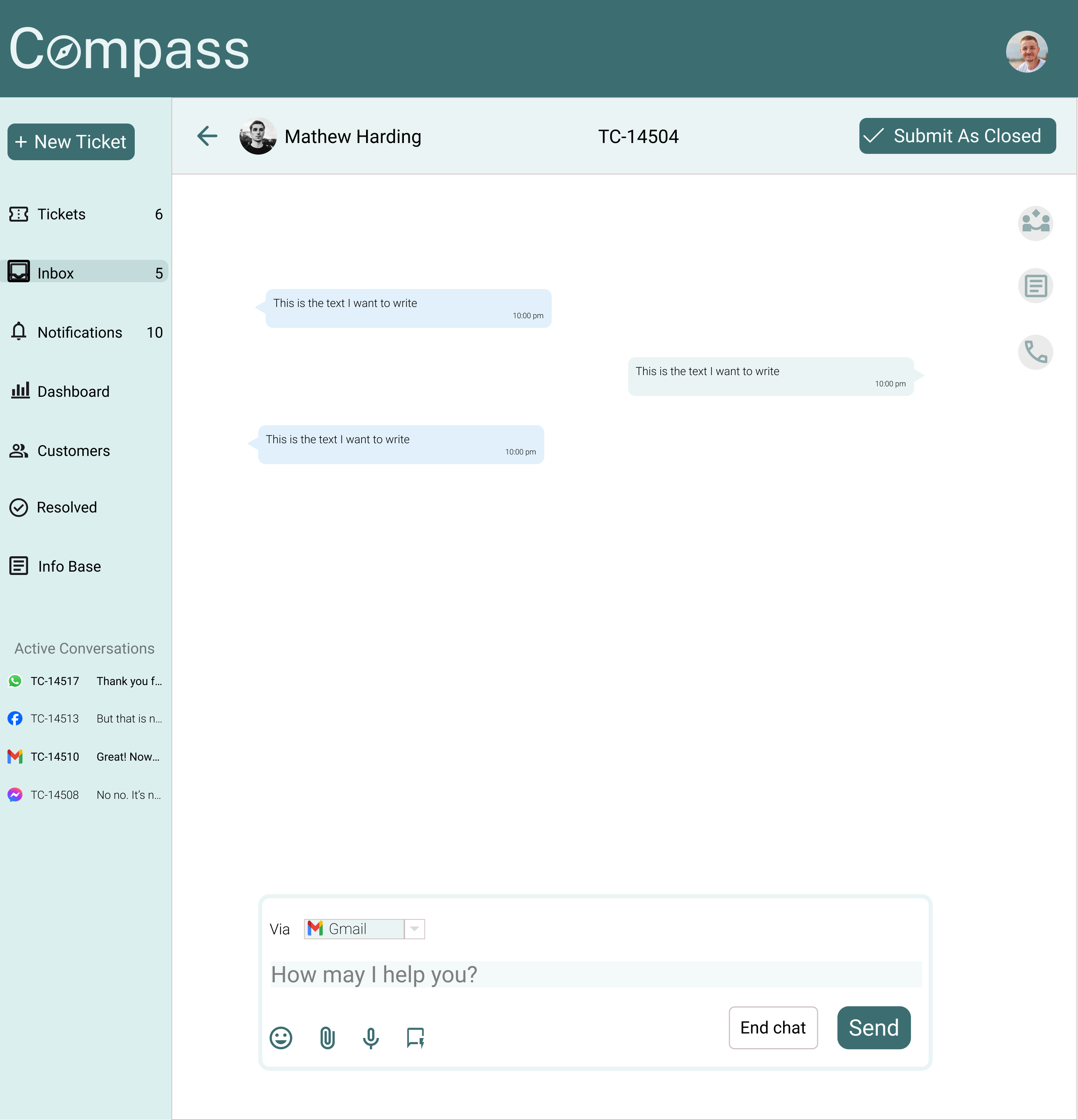
Ticket Creation
Ticket creation was designed to be as simple and accessible as possible. Agents can create a new ticket from anywhere within the tool without interrupting their workflow. From the same interface, agents can select categories and priorities, add customers to tickets, and send tickets via email, chat, and other supported channels—ensuring quick and consistent issue handling.
Customers
The Customer Database was designed to give agents quick and intuitive access to essential customer information such as name, contact details, and ticket history.
When an agent clicks on a customer, a pop-up window opens with additional details including social media handles, languages spoken, time zone, and average response time. The view also displays the total number of tickets with clear indicators for active and resolved ones. To further streamline workflows, agents can filter ticket history and easily access past interactions, helping them respond faster and with better context.
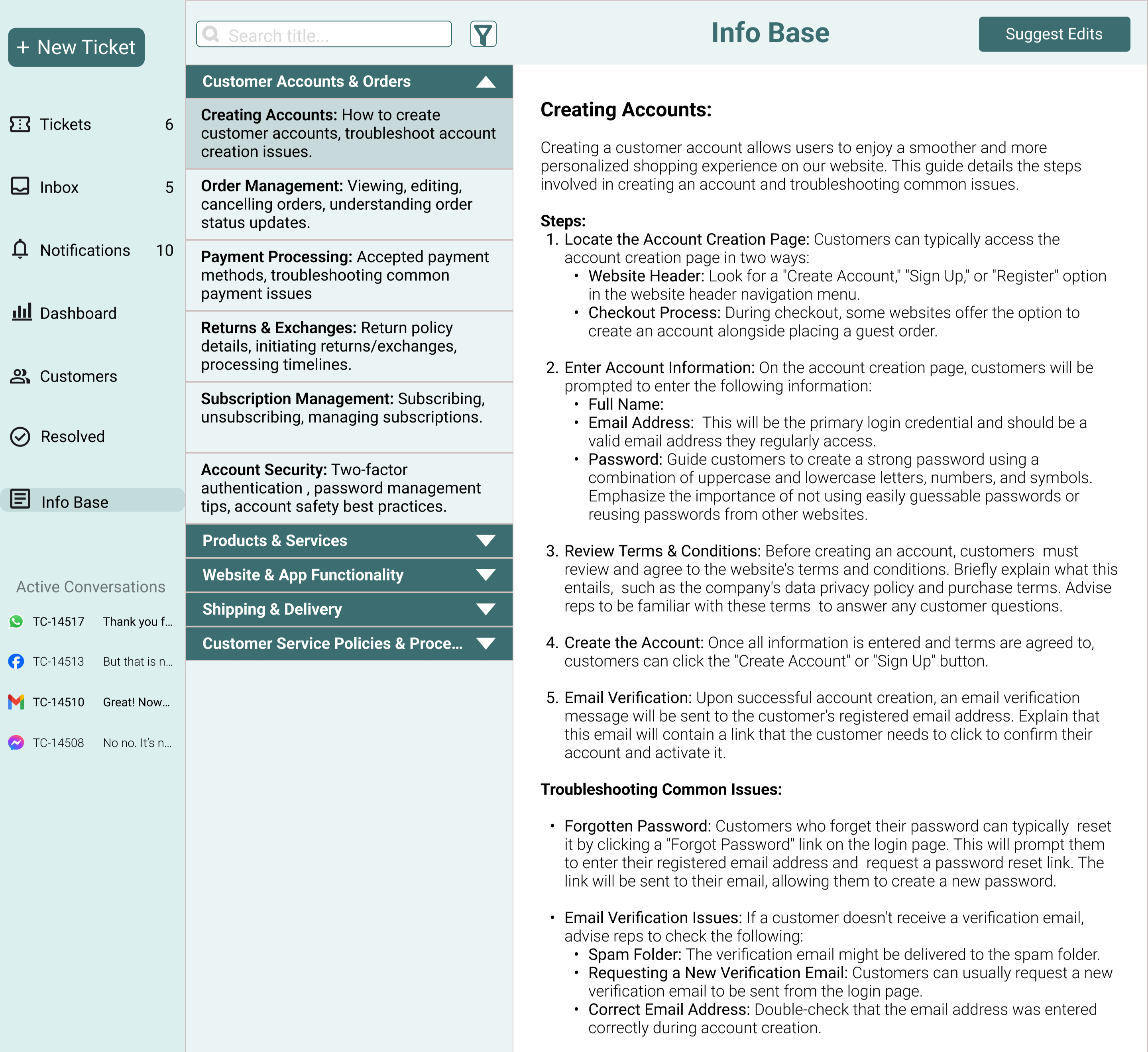
Info Base
The Info Base was designed as a comprehensive repository of helpful articles to assist agents in resolving common customer queries and complaints quickly and confidently. Articles are organized into clear categories, making it easy for agents to browse and locate relevant information. A search feature further enhances usability, allowing agents to find specific articles with speed and ease during live conversations.
Testing Insights and Next Steps
I tested the prototype with a diverse group, including current and former customer support agents, as well as individuals with no prior customer support experience. Since the tool is designed for freshers, their feedback provided valuable perspectives. Below are the key observations and the corresponding improvements.
Active Conversations Section
The section originally displayed the message source and Ticket ID, but most users found this unhelpful as they couldn’t identify tickets at a glance. They had to open previous messages to understand the context, which added friction.
To resolve this, I updated the design to display the customer’s name and profile image, enabling faster recognition and better contextual clarity.
Breathing Space
Many users felt that certain pages displayed too much information, making the interface feel cluttered and overwhelming.
To address this, I introduced an option to hide the toolbar when not in use. The toolbar appears on hover, creating a cleaner and more focused workspace for agents.
Call Transcription
During testing, agents shared that a significant portion of communication happens over calls, requiring them to manually jot down important details.
As a solution, I proposed an automatic call transcription feature, allowing agents to focus on the conversation while ensuring important information is captured accurately.
Tooltips for Better Clarity
Some users, especially those without prior customer support experience, felt unsure about certain icons and features within the interface.
To improve usability, I added contextual tooltips that display brief explanations on hover, helping users understand functionality without external guidance.
Outcome & Impact
While Compass is a conceptual project, the design decisions were guided by clear user and product outcomes. The goal was not just to improve usability, but to create a tool that supports agents, reduces onboarding friction, and enables consistent performance across experience levels.
Intended User Impact
- Reduced cognitive load for freshers by simplifying workflows and familiar UI patterns.
- Faster onboarding through intuitive navigation, tooltips, and in-context assistance.
- Improved confidence and communication quality through grammar assistance and knowledge access.
- Lower dependency on team leads due to built-in collaboration and guidance features.
Intended Product & Business Impact
- Shorter onboarding time for new agents, reducing training costs.
- Higher agent productivity by minimizing context switching and manual work.
- More consistent service quality across agents with varying experience levels.
- Better visibility into agent performance through clear dashboards and reporting.
Success Metrics (If Shipped)
- Time to first successful ticket resolution for new agents.
- Average handling time per ticket.
- Error rate in customer communication (spelling, grammar, miscommunication).
- Agent reliance on team leads or escalations.
- Adoption and usage of knowledge base articles during chats.
Key Learnings
Working on this project pushed me to grow beyond execution and into deeper problem-solving and decision-making. Each challenge shaped how I approach complexity, research, and design today. These are the key learnings that will guide my work moving forward.
Big challenges are best tackled in small steps
Working on a project of this scale made it clear that progress doesn’t come from solving everything at once. Despite careful planning, unexpected challenges emerged at every stage. Breaking the problem into smaller, manageable steps helped me stay focused, make steady progress, and build confidence through incremental wins.
Research and testing are tough, but invaluable
Finding participants for research and testing was one of the most demanding parts of this project, especially without incentives or organizational backing. Despite the effort required, research proved essential. It revealed real user struggles that would have otherwise been easy to overlook, ensuring the product remained grounded in actual needs rather than assumptions.
Interviews work best when people feel heard
Early interviews were too structured, limiting participants’ ability to share freely. During usability testing, I shifted my approach, allowing open-ended feedback and focusing more on listening than directing. This change surfaced deeper insights and reinforced the importance of empathy and trust in meaningful user research.
Solve the problem first, then design the solution
Early on, I found myself over-focusing on visual details before fully resolving core workflow challenges. Stepping back to reassess user flows and priorities helped me realign the design with real user problems. This reinforced a crucial lesson: strong design starts with clarity of purpose, not aesthetics.